
As 2015 comes to a close, many people look ahead to 2016 with a renewed enthusiasm for their personal & family life, their spiritual life, and their work life. We should look ahead with no less enthusiasm for what digital marketing trends and web design trends will shape the next 12 months and beyond.
5 Web Design Trends You Need to Know
1. Responsive Web Design:
If you’re unsure whether or not your website is responsive, it probably isn’t (gasp!). If you have yet to take the plunge into responsive web design, 2016 is your year. Google has been actively penalizing sites that aren’t responsive. Plus, a non-responsive site makes for a pretty sh*tty user experience. You need to take this seriously.
If you need a responsive website, talk to us today. We promise not to judge you for waiting so long.
2. Material Design
Material design is a design language developed by Google, with the specification being published in 2014. The goal is to:
“…create a visual language that synthesizes classic principles of good design with the innovation and possibility of technology and science.”
What does this mean? Material design is focused on making sure good design translates well across all devices. And as a result of the overwhelming use of smartphones to view websites, material design has flourished. As mobile use continues to overtake desktop use, we can only anticipate the growth of material design.
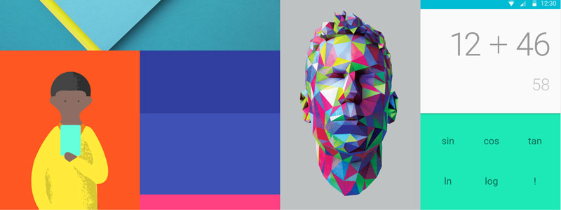
As an example of how material design can be applied, let’s look at designing a website layout using material design. The emphasis is on utilizing the grid in such a way that the site can adapt and scale well when on a variety of devices. Material design is as much about the interaction with the site, as it is the site and content itself. Material design aims for a natural interaction between user and content, utilizing an ease of animation and other more natural motion concepts.
You can expect sites founded on material design to be focused on colors that are “…unexpected and vibrant.”
3. Unique User Experiences:
As web design becomes more streamlined, we have been hit with a wave of “sameness.” In 2016 you can anticipate an incorporation of various elements to make a site less cookie-cutter. Hand drawn illustrations and icons, a unique use of the grid layout and more will become increasingly popular. This will aide in storytelling and it makes for a more compelling user experience.
But beware – there IS such a thing as too many frills. Your web design project should – first and foremost – focus on how it translates to mobile and tablet devices. Are you drawn in by a flashy animation, but it renders poorly on your iPhone? Ditch it! Think mobile first.
Take advice from Sophie Paxton, an Australian-based UX (user experience) and interaction designer:
“Be able to justify the use of each animation in terms of benefit to the user. ‘It looks pretty’ doesn’t qualify.”
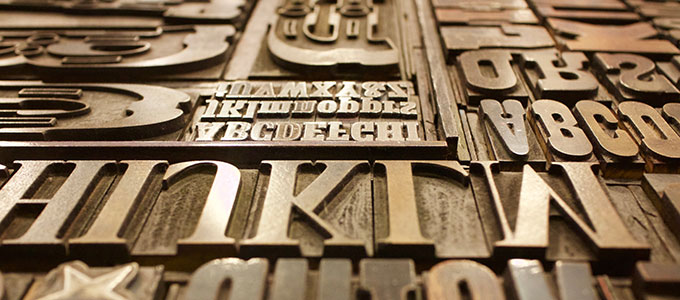
4. Great Typography:
2016 will see a sharp rise in the use of beautiful typography to illustrate concepts and convey important messages on web pages. Although typography has always been an important consideration for web design, never before have designers had this much freedom, thanks to Google’s ever-expanding selection of free web fonts.
Take note: choose your fonts wisely. Again, your primary thought should be “mobile first.” Does the font selection aide in not only the design, but also the readability on smaller devices? If the answer is no, then it’s not a good choice.
5. Accelerated Mobile Pages (AMP):
Perhaps the most exciting advancement for web design in 2016 is the recent announcement on October 7, 2015 by Google to introduce AMP (Accelerated Mobile Pages).
“AMP HTML is a new way to make web pages that are optimized to load instantly on users’ mobile devices.”
This is some seriously exciting stuff. AMP provides a way for web developers to design a site in such a way that the content will appear instantaneously across devices. No more waiting for those images and articles to load on your mobile phone.
Even if you’re not a web developer, it’s important to read up on - and understand - accelerated mobile pages (AMP). Your site visitor will always benefit from a faster-loading site.
Are you concerned about your website’s loading time? Contact us today. We can discuss AMP pages and other strategies that can improve your site speed and overall SEO (search engine optimization) performance.
As you can see, 2016 web design trends are focused on usability for the mobile web. If you haven’t shifted your thinking to “mobile first,” now is the time.


